tuesday, march 27, 2007
Excerpts from my moleskine, part II
Here’s some of what I’ve written in my notebook, both so I can find it later and so you can read it. See the first part of this series.
Draw, you rogue, for though it be night, yet the moon shines. I’ll make a sop o’ the moonshine of you. You whoreson cullionly barbermonger, draw!
From King Lear, Act II, scene 2.
Some of my notes on a talk by Steven Pinker:
Swearing is an emotional weapon; it invokes the supernatural, scatology, disease/death, sexuality, and disfavored people, and uses poetic devices to engage the listener.
The feeling that you are stupider than you were is what finally interests you in the really complex subjects of life: in change, in experience, in the ways other people have adjusted to disappointment and narrowed ability. You realize that you are no prodigy, your shoulders relax, and you begin to look around you, seeing local color unrivaled by the glows of algebra and abstraction.
From The Mezzanine by Nicholson Baker, page 24.
A professor visiting my CCS history class said that educational experiments never fail. People get interested and excited, try to make it work, overlook imperfections, put in effort — even if the idea behind the experience isn’t very good — so they learn a lot.
Real ladybugs don’t look much like some of the symbols that represent them; “friendly” bugs get anthropomorphized pretty heavily. Many pictures of ladybugs apply baby-mammal-like proportions to the defining features of their insecthood. Compare this to symbols representing spiders.
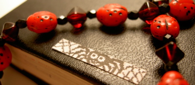
(Excellent sticker courtesy of Nasty Nets. And not actually in my moleskine, but relevant:)

![]()


comments (0)
Unsolicited comments on boring ads
The United States Postal Service has an ongoing promotion where it sends everyone postcards about its services, illustrated with Cathy comics. People don’t seem to like them much. Here’s one that somebody on Flickr took a picture of:
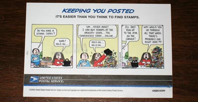
I saw one of these a while ago and had a great time analyzing the dichotomies that it struggles with: formal/casual, strange/normal, advertising/public-service. It’s eye-catchingly dumb. Cathy is like Garfield: bland, inoffensive, and appeals to the lowest common denominator. The characters are familiar to everyone, but in a different context (the back of the newspaper), so these postcards capture your attention more than a normal announcement would. The choice seems strange, though, because the Postal Service is using its semi-public money to subtly advertise for a private enterprise — so would the postcards be more effective if they commissioned a Cathy rip-off instead? People might not dislike those postcards so much (they’d still be lame, but without the hyper-unfunny connotations of Cathy), but they wouldn’t draw as much attention.
While discussing this, a friend said, “Part of what struck me as odd is that the Post Office presents itself as a serious shipping firm, like UPS or FedEx, but then it sends this whimsical notice about services, and more so, it was a notice about vacation hold on mail. Is anyone unaware of that?” Are enough people unaware to make this a cost-effective promotion?
From the USPS press release:
“We’ve begun a dialogue with our customers about our services, and chose two characters [Cathy and Dilbert] everyone can relate to in helping to tell our story,” said Anita Bizzotto, USPS Chief Marketing Officer and Executive Vice President. “We wanted to connect with people in a way that was interesting and humorous.”
I don’t think it quite worked: it got the message across, but not in the desired positive way. I wonder whether they asked any real people about how much they “relate” to Cathy; I don’t know anybody who does. Maybe the Dilbert postcards are more effective, but I haven’t seen them.
comments (2)
sunday, march 25, 2007
Today I met a bunch of internet friends
This morning Doug and I went to BarcampLA (an event where nerds get together to be nerdy) and livemoblogged with the great and revered John Wiseman, which generated content like the following picture of a double-twittervision moleskine-note-taking session:
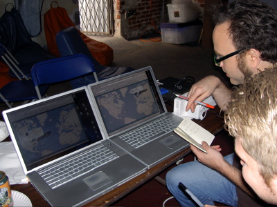
Then we listened to several self-promotional presentations, including a couple of amusing ones, and talked to neat people. Doug and I are probably going back tomorrow for more.
In the evening, we maneuvered over to Chinatown for some Nasty Nets Art Show Fun and were rewarded with grade-A surfing selections of YouTube and Flickr and other lovely artworks as well. I met some of the lovely members themselves, and after dinner and further intra-city maneuverings, it was dance-talk party time, nerds-only-style (no dancing required). There were cheetos (cheetoes?) involved. Also fun (fun?).
I think it is late at night (early in the morning? (4:30 am?)) and I will go to sleep now (before I write any more).
comments (1)
thursday, march 22, 2007
It’s OK enough to show the world
My final assignment for New Media class was to use Flash to create a “new media work” that “uses a diagram or map as its interface”. I know that the only good Flash movies are entertaining (see monkey pops, la historia del mamut, etc.), but of course I tried to make something informative and useful — while wondering why I was having such a hard time. This is the result:
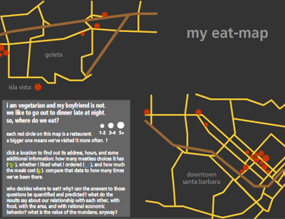
It’s an eat-map (ha ha, like heat-map) of the Santa Barbara area: a bunch of mini-reviews of restaurants I’ve visited with Doug. Then I wrote five pages about the implications of this project:
…my eat-map displays narratives, facts, words, and images in order to both memorize and communicate…these mundane facts are collected and pored over as ways to more efficiently exchange money for satisfying experiences…by putting these experiences into information, I reveal the shapes and forms within them: a spatial memory of where restaurants are, shaped into a map; a knowledge of how often we go out to eat, reduced into the sizes of circles…blah blah blah.
If you don’t want to bother with new media, here is my list of good places in the Santa Barbara area, ordered by closing time:
- Andersen’s — 9 pm
- Fresco — 9 pm (Sun closed)
- Dish Cafe — 9 pm (Sun closed)
- Playa Azul Cafe — 9 pm (Fri-Sat 10 pm)
- Flavor of India — 10 pm (Fri-Sat 10:30 pm, Sun closed)
- Sojourner Cafe — 11 pm (Sun 10 pm)
- Paradise Cafe — 11 pm
- Blue Agave — 11:30 pm
- Woodstock’s — 12 am (Fri-Sat 1 am)
comments (2)
sunday, march 18, 2007
Lists are easy to like
These are the obligations of a songwriter, according to a book about the Velvet Underground, quoted by a reviewer:
- observe and describe characters in situations;
- use simple words to convey rich thoughts;
- deal frankly with those people otherwise dispossessed of song;
- carry a hint of the subconscious at play, of shrewd implications about personal identity and social anxieties;
- possess a dry humour, finely balanced between satire and cynicism.
I like this list. It is good for any type of creative writer if you replace the “song” part: a poet, a novelist, a blogger, Dr. Seuss.
comments (2)
saturday, march 17, 2007
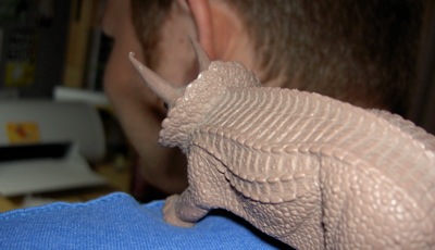
Douglas with a dinosaur
This is my boyfriend:
One day I complained to him, “Waaah, my del.icio.us linkroll [“things i find”] uses dumb quotes ["], not real curly quotes [“”], unlike the rest of my SmartyPantsed blog. It’s so inconsistent and ugly that my eyeballs burn.” This got his haxor brain thinking, and he fixed it despite the wrangling with Blosxom and Unicode it involved. Yay!
comments (4)
tuesday, march 13, 2007
Many standards arguments hide in these corners
Which is an extended color name in CSS, and which is an alpaca yarn color?
pistachio	blanched almond
midnight sky	seashell
barn red	fire brick
fern		thistle
old rose	misty rose
wedgwood blue	navajo white
denim		peru
mahogany	corn silk
nutmeg		papaya whip
dark spruce	antique white
If you said the first column was Honey Lane Farms and the second was web design, you’d be correct! Also, you’d be lying; you can’t tell the difference. Bonus: both color systems include bisque and lemon chiffon.
I adore CSS color names. They are a perfect opportunity for making sneaky jokes, such as using all food-name colors (chocolate, tomato, honeydew, salmon, wheat), or making a snowman snow-colored. See the happy post-xmas tree for an example which happens to also illustrate my deep love for Unicode dingbats.
comments (2)
thursday, march 08, 2007
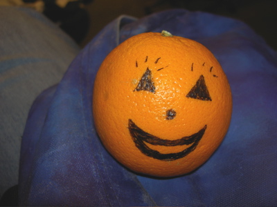
An orange’s slow decline
Who? Me.
What? An experiment in fruit decay.
When? Indefinitely.
Where? The CCS Computer Science lab.
Why? Perversity.
January 22 — shiny, happy.
March 8 — wrinkled, deranged.
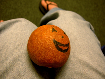
comments (4)
monday, march 05, 2007
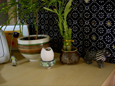
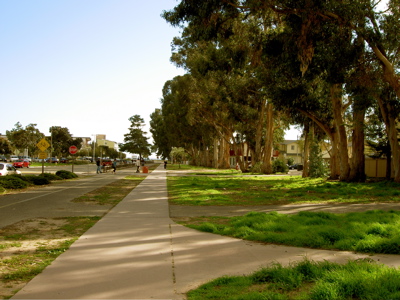
Pictures unreasonably tinted yellow
I miss San Francisco, with its good food and public transportation and excellent people. Instead, I have Santa Barbara and a gigantic line of eucalyptus trees planted a long time ago to defy the wind. If you look into the distance, you see the ocean.
I also have my desk, chosen and arranged like everything else. Each object has an origin story: the IKEA in Irvine, Los Angeles’ Chinatown, San Francisco garage sales, the pirate store, New Orleans, sisters.