wednesday, march 01, 2006
Please error login
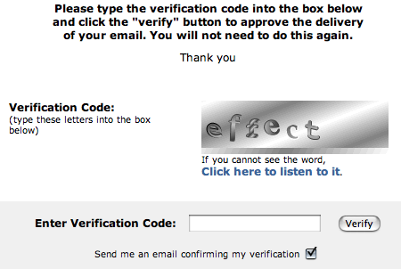
It’s time for the latest edition of snarky comments about dumb interface tricks. These are pretty old, so I don’t remember where most of them came from.

Please read the text in this image to see what I’m pointing out.
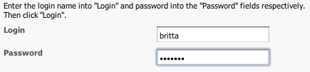
This could only be better if it said “please”.

I like the polite honesty, but “Error” might be construed as robot discrimination.

This is what happens when you have stupid product names, Larry.
Other editions: college, silliness, original.
comments (2)
sunday, january 29, 2006
Ranting on a nice spammy day
As the friendly automaton behind a support email address (these are only my personal opinions, by the way), I see maybe six or seven challenge-and-response emails a day. I believe the makers of anti-spam solutions did not design for efficiency on the sender’s end. Not that I would expect them to. They all suck.
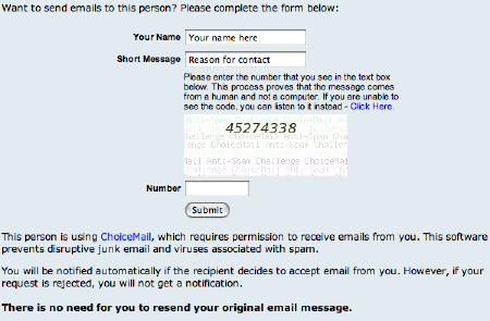
Besides having a doubly-stupid name, they don’t use a standard email address (like person@choicemail or choicemail@domain) so I can’t filter them out along with the other anti-spam emails. I don’t want to fill out a “Reason for contact” — it’s enough that I have to type in a random string of numbers. Eight numbers is too long, anyway; the eye processes things in groups of three or four (note license plates and telephone numbers). Is this “notification” by email or in the browser? Ambiguous language. Crappy form. Suck.
Earthlink Spamblocker (image edited to remove addresses):
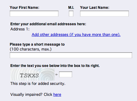
These fill in your “name” for you, but don’t accept periods as part of a name, so I have to re-type it every time. I don’t want to type in a “short message” when the email has already been sent. The best thing about these is that I’ve only seen three or four different CAPTCHAs in the dozens of times I’ve filled out their forms. Can’t bother to generate random images? Suck.
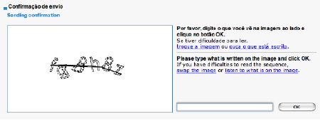
These ugly CAPTCHAs are often hard to read and I have to do it a couple times to get it right. The “Sending confirmation” title is weird and ambiguous. Mostly, I don’t like having to stare at fuzzy letters. Suck. But I think they made “tira-teima” into the Portuguese equivalent of “challenge-and-response email”, which is an unwieldy phrase. So I like that.
A simple form and an easy CAPTCHA make things nicer. I like the familiar-word approach because I don’t have to peer at each character while I type it. The pre-selected confirmation email checkbox is annoying, though. I don’t want a verification email, so I have to mouse over and uncheck it every time. Half-suck.
comments (8)
thursday, december 01, 2005
Money and other dirty things
A year or so ago in Economics class, my partner and I invested an imaginary $81,000 in the stock market. How is our money doing?
The $16,000 divided among Gap, Hershey, and Nike stayed about the same. We chose them because they seemed solid, but I guess they didn’t have much room for growth. Starbucks went down 40% and Red Robin (a burger chain) went up 10% for a combined loss of $2,400 on an $18,600 investment. So, investing in Starbucks was dumb, but Red Robin did fine — the only non-globalized corporation in the bunch.
But of course, I put most of our money in Google and Apple. They’re important companies and I liked them despite their evil tendencies (this is the stock market, after all). The $37,000 I invested in Google grew to $82,800. That was a lot of money in a single company, but it doubled. The $9,700 I put into Apple made a profit of $4,700.
I could be paying for most of college with the $50,500 total profit — a 40% return.
comments (1)
thursday, june 23, 2005
Squirrels and colleges
Oh man! All throughout my strenuous college decision-making process, I forgot about the Campus Squirrel Listings. I found this site two years ago and knew that it was going to be part of my selection criteria…
The quality of an institution of higher learning can often be determined by the size, health and behavior of the squirrel population on campus.
“Field reporters” gave UC Irvine one out of five little squirrel icons and UC Santa Barbara three. I guess I made the right choice. However, UC Irvine has cute little rabbits everywhere.
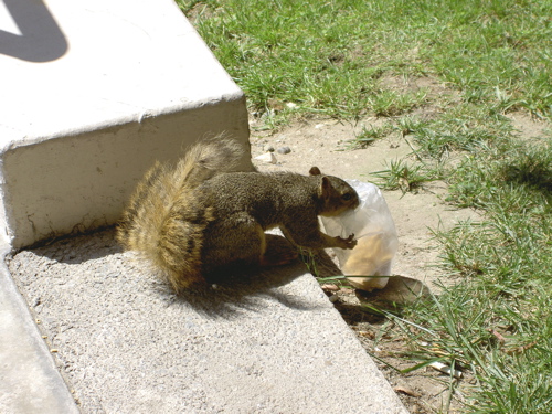
The University of Southern California has a lot of squirrels too, but most of them are kind of raggedy-looking.
comments (0)
thursday, april 21, 2005
Complaining about MyPyramid

The government’s new MyPyramid.gov websites are crappy. The name is dumb, the interface is pitiful, they aren’t very accessible, and they look bad. Judging by the nice PDFs available, they just needed to find some real web designers.
First, that name is pretty bad. “My” should be “Your” and CamelCase is unnecessary. It’s not much of a pyramid anyway, more like a staircase-triangle. Here’s a few bonus points for including the TLD in the site name.
Exploring MyPyramid.gov is just painful, with too many badly-organized choices and weak navigation on deeper pages. I tried to learn more about my daily servings of food groups but gave up halfway through because it involved so many clicks. At least the basic recommendations are easy to find.
My Pyramid Tracker is worse. A zillion clicks allow you to analyze your precise energy needs — if you’re dedicated and have a lot of time. The interface is crap. There are too many specific choices for foods and activities. But once I finished it, the analyzations were good.
The accessibility statement is lame. A lot of the sites’ text is inside images. Some of the detail text is in capitals (eek!). In several places, the background/text contrast is poor. The pages look cluttery and badly-spaced, like most table-based layouts.
The new pyramid could use more density of information. You need to read the website to figure it out. The basic version doesn’t have any pictures on it — you shouldn’t have to refer to a key. The brain does not find it easy to translate those proportional wedges into servings of food. Also, I don’t like the large amounts of dairy and that the vegetarian information is almost hidden. Oh well, the little staircase guy is cool.