the letterpress projects of fall 2006
My college has a wonderful Book Arts department, the only one in the University of California system where you can get a degree in the stuff. I took the Beginning Letterpress class and learned this much and so much more.
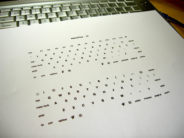
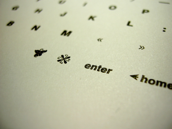
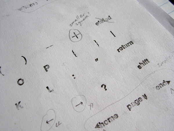
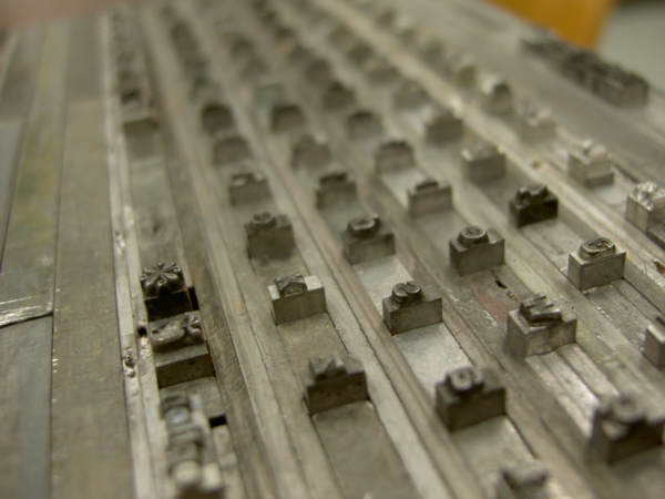
Assignment: alphabet sampler. This is my keyboard, printed. I used some odd dingbats for keyboard characters that our type cases don’t have, like the Apple symbol (replaced with a hedera) and caret (replaced with a dagger). “HelveTica 14” mimicks “PowerBook G4”. It has two sections for lower case and upper case.
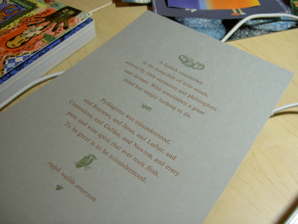
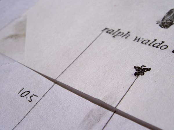
Assignment: use these gray cards and some dingbats. I used one of my high school English teacher’s favorite quotes. The chainlinks and owl are symbols of consistency and wisdom, and the dingbats have a naturalistic theme since Emerson also wrote about nature. The reference to “consistency” is also a play on the letterpress process: no two prints are the same.
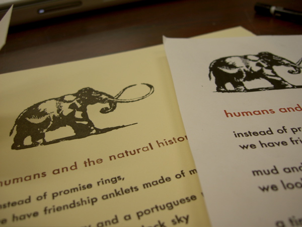
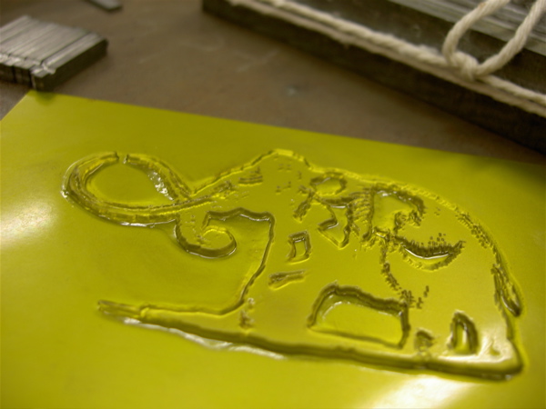
Assignment: do something in relation to memory. This is a poem I wrote about a visit to the Santa Barbara Museum of Natural History with my boyfriend at the time. I made the print look like it belongs inside the museum, with its soft yellowish paper and a typeface popular in the 1960’s. The mammoth is a little pixelly, referencing digital mediums inside this analog one — obliquely referring to the interests of the people involved.
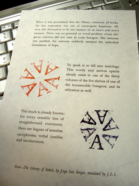
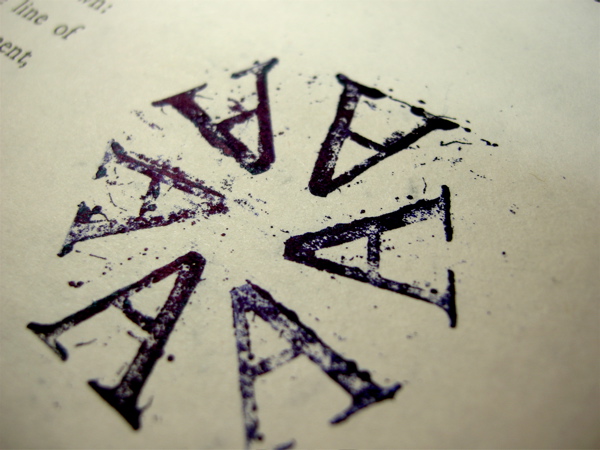
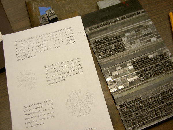
Assignment: learn something new. This text says “The universe was justified”, and I manually justified the text (with many hours of effort). The jumbled, hand-stamped A’s — alephs — form hexagons, like the rooms in the Library. A type case is a “verbal jumble” that holds an innumerable number of potential texts. Of course, Borges is one of my favorite authors and this text makes me think about the internet; his story is also inspired by an idea from one of my favorite books, The Anatomy of Melancholy.
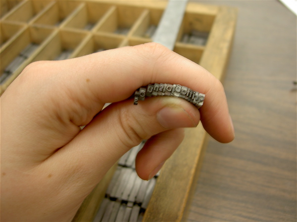
My hand and my name.