sunday, august 05, 2007
Things I found at the bookstore
Poking around William Stout Architectural Books, I picked up Representing the Passions because “passion” is a loaded word and the cover looked pretty, and I skipped to “Observations on the Natural History of the Web” by Horst Bredekamp, which traces a connection between early modern engravings of personified Nature (including the Leviathan) and late-90’s net art gardens: Nerve Garden, TechnoSphere, and Life Spacies II. I like that connection, and it reminds me of the plant-related net art that Petra Cortright has made recently. Horst Bredekamp has also written a book titled The Lure of Antiquity and the Cult of the Machine: The Kunstkammer and the Evolution of Nature, Art, and Technology, which means that he is my kind of academic.
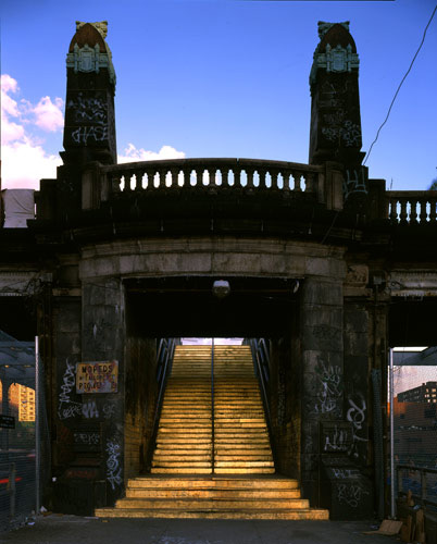
Then I flipped around in a big square book of public art, and I liked this gilded staircase in New York:
The typography books were generally bland, but Dimensional Typography included amusing bits like “The circumflex and the circumcision are both forms of marking. The three-dimensional extrapolation of the circumflex reveals a distinct homology.” and a connection between crowns of thorns and rhizomes.
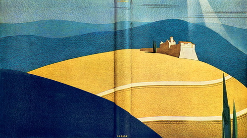
When I saw Art Deco Bookbindings on a shelf, I knew I would like the subject:
There’s more here; most of it is nicely geometric, and I especially like the typographic ones near the end.
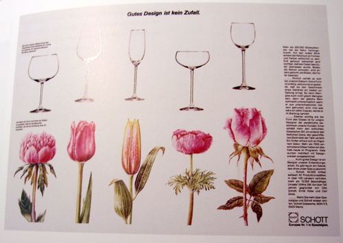
Then I looked at the industrial design books and found a neat ad:
It reminds me of The Architecture of Happiness, page 86:
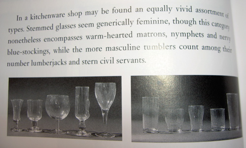
The next page continues, “If we can judge the personality of objects from apparently minuscule features…it is because we first acquire this skill in relation to humans, whose characters we can impute from microscopic aspects of their skin tissue and muscle,” which goes back to the book about passion, since it included an essay about systematized representations of strong emotion in faces. Books are annoyingly physical objects though, so I can’t re-read it right now and include more detail. Of course, the most annoying thing is that the contents of books can’t be bookmarked on del.icio.us, so I have to write something about them.
comments (0)
sunday, january 21, 2007
Excerpts from my moleskine
Orthoepy and orthology: the study of pronunciation and correct diction.
“An important book without an index is like a ship without a rudder.”
the anatomy of melancholy at four in the morning, pirated fonts and surfing the internet. now go and brag of thy present happiness, whosoever thou art. future speakers even more alienated by early modern english are like future web browsers deciphering html from 1999, both human and machine. thou seest in what a brittle state thou art…what a small tenure of happiness thou hast in this life, how weak and silly a creature thou art.
The screen mimics the sky, not the earth. It bombards the eye with light instead of waiting to repay the gift of vision…We look to it for clues and revelations more than wisdom.
The Elements of Typographic Style, page 193
listening to Bei Dao read his poetry:
- “high tide is a matter of alcohol content”
- “drinking a cup of words only makes you thirstier”
- “sleep stuffed with rope straw”
- “to all the days in a line, endlessly chattering, he says ‘no’”
- “jujube forests of a street vendor’s first love”
comments (1)
tuesday, december 26, 2006
They look better on paper
These are little typographical things that I mocked up for letterpress class. Numbers one and three turned into actual prints; I’ll show you pictures of them eventually.

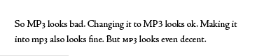
Today, I read part of a book that uses text figures (aka old-style figures or lowercase numbers) and mentions MP3s a few times. They didn’t pay very much attention, though, and left the combination alone instead of making it nice…
comments (0)
monday, october 16, 2006
Keyboard typing, laserjet printing
Movable type makes you think about:
- The tiny spaces between words and letters
- Whether you have enough “F”s to finish your idea
- How “A” and “a” are completely separate letterforms
- How slow the previous process must have been to make this such an improvement
- How 10em, .2em, and 1em are things you can hold in your hands (and how .3em, 200em, and 0em are nonsense)
- How nice it would be to work with a monospaced font
- Uncommon punctuation as a limited resource to be gathered and treasured
- The negative space on the right end of a line of type
- The drop-down font menu as an analog of labeled font drawers
- How separating content from presentation is impossible in some cases
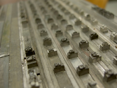
The little dingbats on the left represent an Apple/command key on my PowerBook keyboard…Gutenberg-style. My galley is full of Helvetica 14 right now, with some Helvetica 10 for effect (caps lock, shift, etc.) and various pieces of punctuation stolen from the Ornaments/Misc. drawers. I know the PowerBook keyboard isn’t in Helvetica, but I wanted to use it anyway. Yes, I’m enjoying this stuff.
It turns out part of my family set newspaper type for generations, which makes me happy: journalism and this laborious print design are antecedents of the things I’m interested in.

